This article is obsolete for On-demand accounts. Please see our guide section on how to create Visual Reports.
Q: How do I create a custom graphical report with team states on the axis?
Our cards are assigned to team and team iterations. The team has team workflow states for user stories and bugs in the projects' process. The project state report is perfect for reporting to management, but the team has some reports that we want more detail in by using the team workflow states.
The problem is, that when I use EntityState for the axis, it uses the project workflow state.
A: It is possible to build a custom graphical report with team states. Key point there is to use Team Assignment as data source in the report setup.
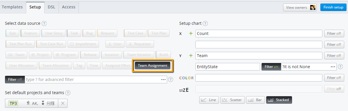
Let's build a basic report showing count of entities per team states in selected teams. Here's the setup we'll apply:
Data source: Team Assignment
X: Count
Y: Team > EntityState
Filter for EntityState property: ?it is not None
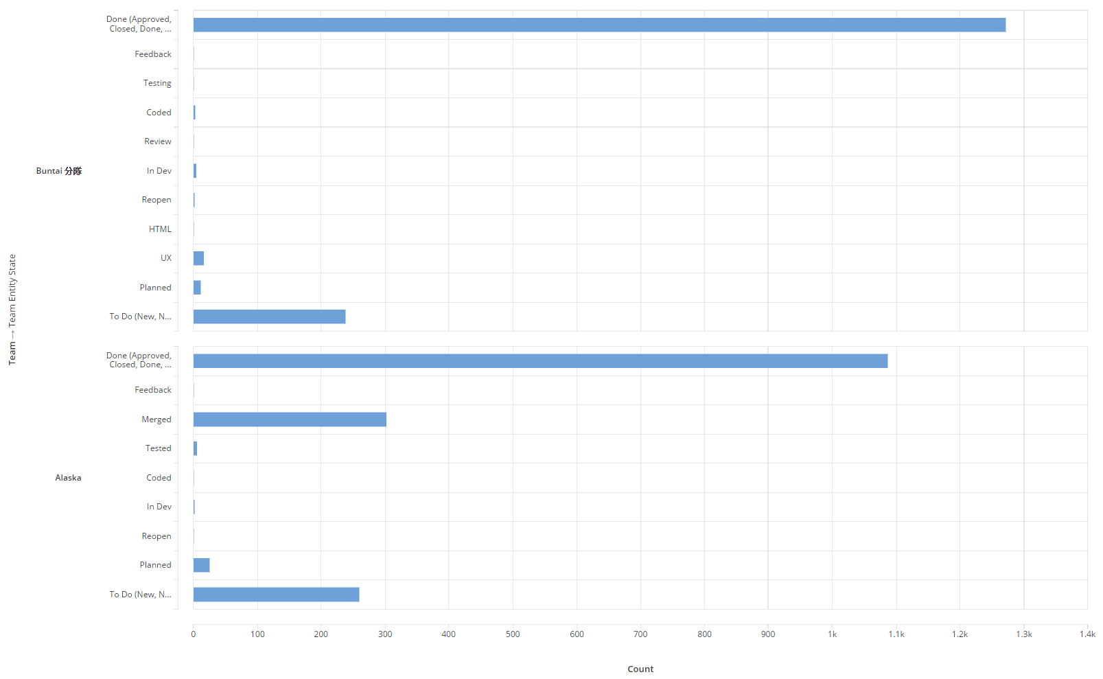
We'll get the report shown below:
Filtering
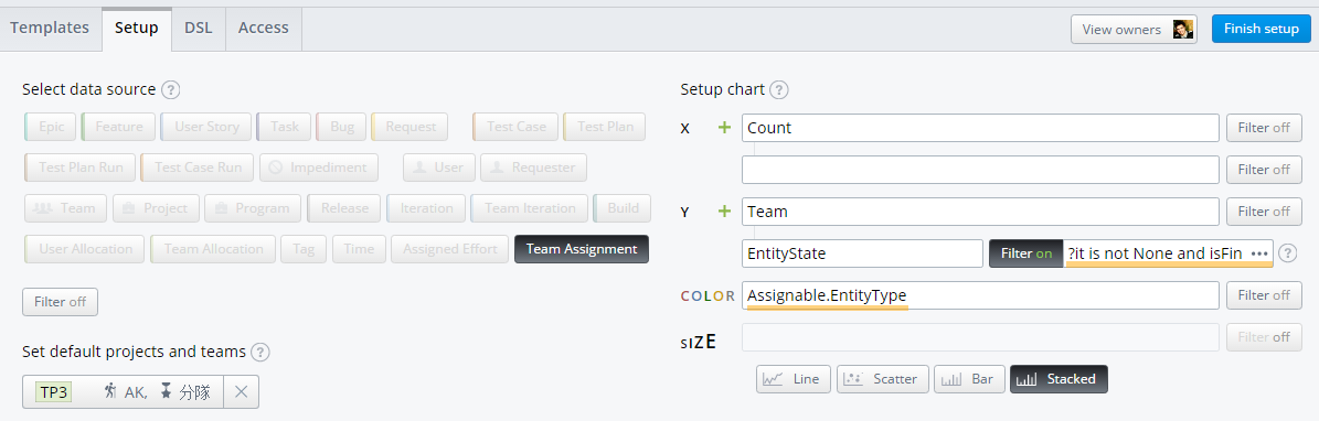
It is possible to exclude some states. Let's hide bars for done items. We'll apply the following filter to the EntityState field:
?it is not None and isFinal is false
It is possible to show types of entities on this chart. We'll put the following rule to Color field:
Assignable.EntityType
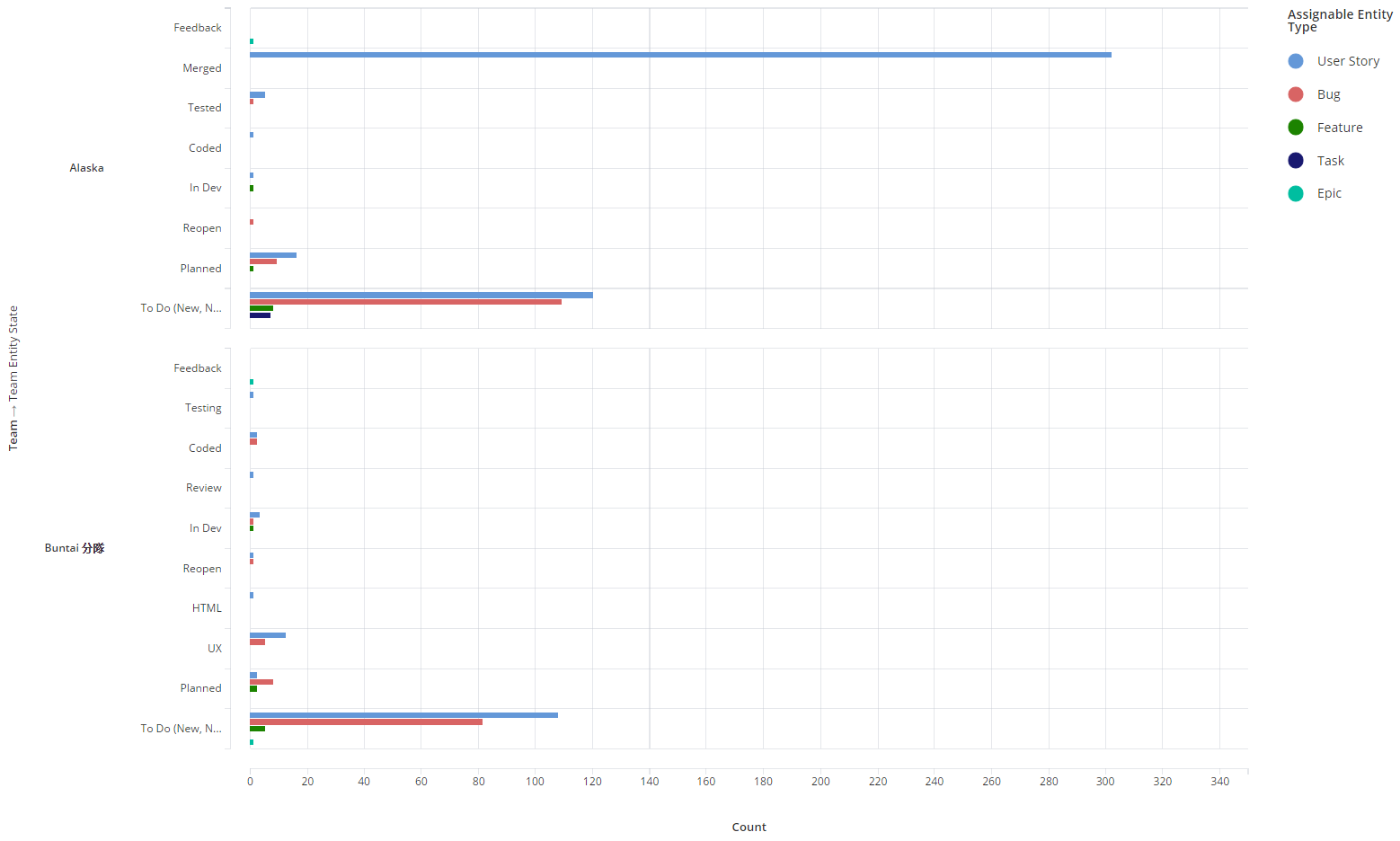
The report now shows types of entities.

It is possible to exclude entities of some types. Let's exclude test plans and test plan runs for example. We'll apply the following filter to the Color: Assignable.EntityType field:
?not (it is 'TestPlan') and not (it is 'TestPlanRun')
Names of entity types must be used without spaces between words there.
And let's switch a report from Stacked to Bar mode. We'll get the following:
Still have a question?
We're here to help! Just contact our friendly support team
Find out more about our APIs, Plugins, Mashups and custom extensions. Join our community of passionate users and even discuss directly with our developers.